Tweaks to the Rollback cover
The cover for Rollback has been slightly revised. The illustration is the same, but the typography is different, and even nicer). The new version looks like this:
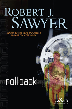
My name is now in a typeface called Minion, and the title of the book is in Yearling Light.
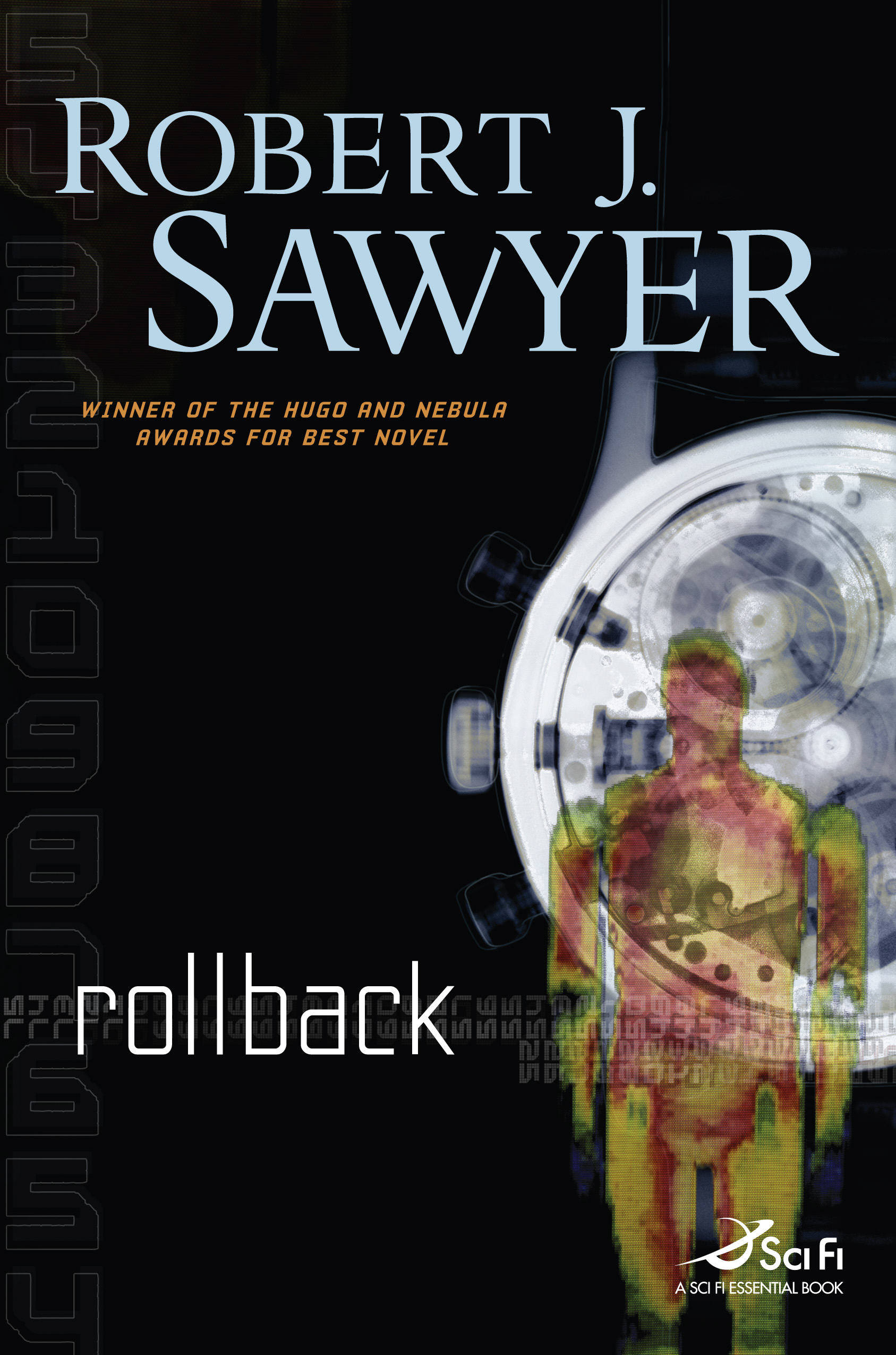
The old version looked like this:

You'll find a high-res version of the new cover, in all its glory, here -- your browser may shrink it; if so, click on the image to see it full size. Note that there's subtle detail in the background -- it's not uniformly black; you may have to turn up the brightness on your monitor to see this.
Many thanks to Irene Gallo and her team at Tor for another wonderful cover!
Labels: Rollback
Posted by Rob on Friday, January 12, 2007
[Permanent link to this post]
4 comments
![]()
![]()


4 Comments:
The revised cover looks great, but the "here" link to the larger size needs a fix --as it stands, the linked file name ends in .jgp instead of .jpg.
Thanks, Jen! I've fixed it! :)
The intersection of the serifs on the W and Y makes the typography centres of by brain tingle.
The old one was great, but the new typography is a lot nicer.
Post a Comment
<< Home