Foxit eSlick: poor line justification
I'm getting tired of high-priced ebook readers that are brought to market without anyone who knows anything about book layout and design having vetted the software they use.
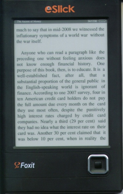
Have a look at this photo, which shows a Foxit eSlick ebook-reading device displaying a .PDB eReader book from Barnes and Noble's Fictionwise.com under the new 2.0.1 build 0205 firmware. The eSlick retails for US$259, the same as the Kindle and the nook.
Every line shows the same error: instead of justification putting an equal amount of space between each word on a line, there is always more space just before the last word on each line.
It's not a LOT of extra space -- but it's enough to be visually irritating. You can clearly see it on this line: "purpose of this book, then, is to educate. It is a."
There is way more space between "is a" than there is between "It is."
Or look at the last line: again, there's way more space between "reality the" than there is between "in reality."
This happens with every eReader DRM format (.PDB) commercial ebook I've tried.
I've already complained to Foxit that there should be an option to turn justification off altogether, but when the device does fully justify lines, it needs to do it properly.
On why users should have the option to turn justification off: One of the big sales points for ebook devices is that they can be used by those who need large print, but the larger the print gets, the worse right justification looks. By forcing it on at all times you take one of the great strengths of ebooks (user-selectable type sizes) and turn it into one of the great weaknesses (aesthetically ugly pages).
Robert J. Sawyer online:
Website • Facebook • Twitter • Newsgroup • Email
Posted by Rob on Saturday, February 20, 2010
[Permanent link to this post]
![]()
![]()


<< Home