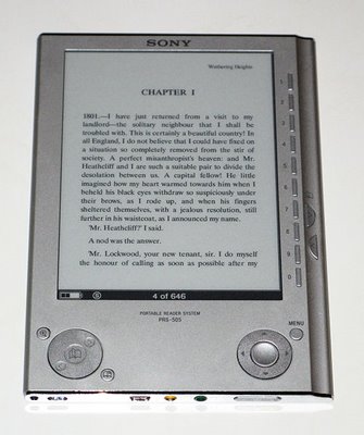
Sony Reader showstoppers
by Rob - June 23rd, 2008.Filed under: ebooks.

On my way to my signing in Rochester yesterday, I stopped at a Borders store to play with the PRS-505, the latest model of eBook reader from Sony. It’s a nice, attractive, solid-feeling unit, and, at $299, not badly priced as these things go.
But it had several showstoppers for me.
Number one (and huge): no dictionary support. Come on, Sony! Even the Rocket eBook a full decade ago let you tap on a word and look it up while reading; not only doesn’t the Sony reader ship with a dictionary (the Kindle does), it doesn’t even offer a way to add one in; there’s no support for looking up words within documents.
Number two: There’s a mirror-like strip of polished metal at the top and the bottom of the case (it looks like a black strip in this photo). There’s no excuse for putting reflective features (glossy finishes, mirror metal) on something that’s meant to be read. This will just reflect room lights back into your eyes.
Number three: crappy page layout. The biggest cost of an ebook reader is the e-ink display, and you should be able to get the most out of the real estate. But the Sony formats books with giant margins, and insists on putting page headers on every page. Thanks, guys, but I know what book I’m reading — and if I’ve forgotten, I can always look. Wasting screen space on headers is dumb, dumb, dumb.
Number four: no way to turn off right justification. It looks lousy at large point sizes, and should be user-selectable; it isn’t.
Number five: proprietary ebook format. Yeah, I know, that’s the way ebook-hardware vendors hope to make their money, but, sorry, I’m not willing to lock my library into devices from a specific manufacturer.
Number six: uncomfortable to hold. See those right-angle corners at the lower left and lower right? They dig into your palm. Corners should be rounded, guys (Kindle makes the same mistake).
Number seven: tiny page-turn buttons. The Kindle probably goes overboard in the other direction, but the ones on the Sony are just too small. (They’re the little half-moon buttons at the far right.)
Number eight: command to switch from portrait to landscape is buried several menus deep. It should be something you can do at any time with the push of a button.
So, the second generation is an improvement over the first, no question. Let’s see what the third generation offers!
The Robert J. Sawyer Web Site

