B&N nook: There's no justification for this!
It's bad enough that the Barnes & Noble nook forces text to be fully justified left and right, whether the user wants that or not, but it does an atrocious job of producing that justification -- among the worst I've ever seen on any e-reading device (and I've been using such devices for nine years now).
To justify properly, you first have to break the line properly. And when deciding where to break a line of text (wrapping what follows to the next line), the rules are simple. Lines should wrap at these characters:
- after a space (with the space itself disappearing beyond the right margin);
- either before or after an em-dash (the long dash—like this—often used in typesetting);
- after an internal hyphen in a word.

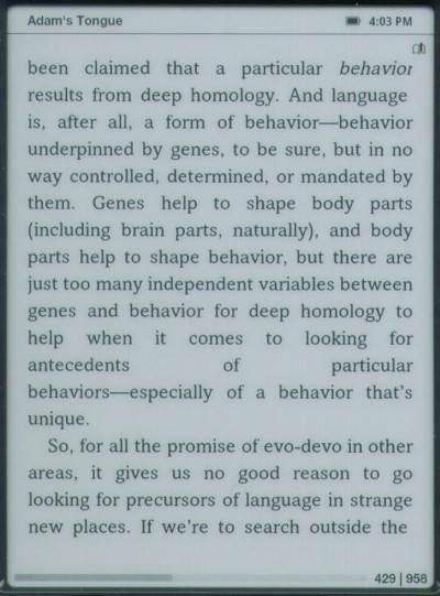
Look two-thirds of the way down the above page. See that line that says "antecedents of particular" with gigantic spaces between each word? That's a result of the nook failing to apply rule 2: the break should have been either before or after the em-dash in the following line (so that "behaviors—" stayed on the previous line). Instead, the nook treated all of "behaviors—especially" as a single word.
(If only "behavior," but not the em-dash, would have fit on the line above, then just "behavior" should have been retained on that line, and the em-dash should have wrapped around to start the next line.)
Note, too, by the way, that the last line of the page is short: it isn't quite fully justified, but instead stops about a half-character-width shy of the right margin. We'll see that error on every page we look at; it's yet another flaw in the nook's rendering of justified pages.
Let's look at another example (Figure 2):

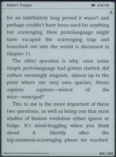
See the second last line, the one that says "about it. Shortly after the," with massive spaces between each word? That's the result of the nook failing to apply rule 3, breaking words at embedded hyphens.
Now, as it happens, in this example, the phrase "big-mammal-scavenging" is really three words strung together to form a compound adjective, but the nook makes the same mistake with single words that have an embedded hyphen (such as the way some people spell "micro-organism" or "co-operation"). The text should wrap after the last hyphen that will fit on the line: if all of "big-mammal-" would have fit, that should have stayed on the line above; if only "big-" would have fit, it should have stayed on the line above.
Oh, and above we see the em-dash wrapping problem again: just below the middle of page, the text should have wrapped after the em-dash in "wise—emerged," which would have eliminated the huge spaces in the preceding line.
As before, the final line on the screen (which is not the final line of a paragraph; yes, it's true that you don't right-justify the last line of a paragraph, but that's not what's going on here) comes up a short of the right margin.
And we discover yet another bit of nook-fail here: see the "the" at the end of the line "sapiens sapiens—wisest of the"? Note that the "e" is slightly clipped; its right-hand edge is trimmed off. We'll see that error repeatedly, too: the cause is that the nook's justification algorithms don't take into account the slanting of italic text, and the italics earlier in the line ("sapiens sapiens") have pushed the final "e" off the active part of the screen.
The "e" is only slightly clipped above, but we'll see that same flaw more egregiously in the next example (Figure 3):

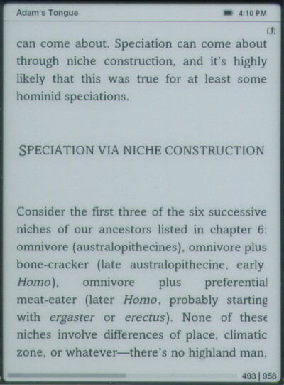
Look at the fifth line up from the bottom of the screen (starting with "Homo"). That line, and the next two, all contain italics, and all three show the clipping of the final character in the line because of it: the "l" in the first line; the "g" in the second, the "e" -- which is missing half of it width -- in the third.
We also on this page see the failure to wrap at an embedded hyphen, resulting in huge gaps between words: the line "Homo), omnivore plus preferential" should have also included "meat-" from the following line.
Now, just fixing the errors pointed out here (the failure to wrap properly before or after em-dashes; the failure to wrap properly at embedded hyphens; the failure to properly justify the final line on the screen) still wouldn't be enough to give the nook decent full justification, because to do that properly, avoiding huge swathes of white space between words, requires the intelligent insertion of hyphens into words.
Look at any printed, typeset book from a commercial publishing house. It will almost certainly have hyphens inserted at syllable breaks in some words at the ends of lines on each page, so that the words can be broken and wrapped over two lines. That is, words of more than one syllable that fall at the end of a line should frequently break after one of the syllables, with a hyphen added just before the break. This is done so that the spacing between words ends up being approximately the same even with full justification.
Hyphenation is a tricky thing to do right. Mobipocket's original attempt to stake out territory in the ebook marketplace was in part based on their claim to successfully hyphenate words -- but they simply used an algorithm that often got the breaks wrong (putting them within syllables, or between pairs of letters in consonant blends); a quick glance at the first Mobipocket book I opened just now showed these incorrect hyphenations within the first few pages: "sta-gnant," "remai-ned," "silen-ce," and "wal-ked" and "deadli-nes."
The only really good way to do it is by having the algorithm hand-coded with the correct syllabification points of many common words, and having it consult a dictionary interactively for uncommon ones. As it happens the Chicago Manual of Style, which is the most commonly used reference for the niceties of preparing text for the printed page, recommends Merriam-Webster's Collegiate for this purpose, which is the dictionary already built into the nook.
Finally, please note that one of the big sales points for ebook devices is that they can be used by those who need large print. But the larger the print gets, the worse full justification looks. By forcing it on at all times you take one of the great strengths of ebooks (user-selectable type sizes) and turn it into one of the great weaknesses (aesthetically ugly pages).
Fixes I'd suggest:
Dear Barnes & Noble, first and foremost, make full justification a user-selectable option; let us turn it off if we don't like it. This already is an option in many versions of the eReader software that underlies the nook, including the Palm version, the Windows versions (both eReader for Windows and BN Reader), the iPhone version, and more. Don't force those of us who dislike full-justification to have to look at it.
Second, if you are going to do justification, do it properly.
What we have here is a classic example of what's wrong with many ebook platforms: a failure to actually look at how it's done in printed books. If you're doing it a different way than it's done in print, ask yourself why. There are millions of guides -- millions of printed books -- you can consult as samples of how it should be done. Please do consult them; please do get it right.
Robert J. Sawyer online:
Website • Facebook • Twitter • Newsgroup • Email


<< Home