Monday, March 1, 2010

Fingering your nook


A suggestion for Barnes and Noble re the nook ebook-reading device:

The very first Palm Pilot going back all the way to 1996 and the original Rocket eBook from 1998 allowed you to do handwriting recognition (on Palms, using the Graffiti or Graffiti 2 system, the former of which used simplified characters, the latter of which recognized fully formed characters; on the Rocket, using the similar Allegro system).

I know in these post-iPhone days it's supposed to be old-fashioned to use a stylus, but for inputting short notes or words to look up, it's much faster to use a stylus than a tiny pop-up keyboard.

The handwriting recognition on these devices turned the characters you drew into text, just as if you'd typed them. Since the nook (unlike the Kindle) does NOT have a physical keyboard, why not take full advantage of the touch-screen interface and allow Graffiti-style handwriting input (as well as the on-screen keyboard)?

The idea that ONLY allowing fingertip input instead of optionally also allowing the fine control of a stylus is like only allowing finger painting instead of using a brush. It's fine for kids the first time they're doing it, but for adults who actually do need to frequently enter text (for annotations, searches, and so forth), it's a clumsy method -- and one to which the nook could easily offer an alternative.
Robert J. Sawyer online:
WebsiteFacebookTwitterNewsgroupEmail

Labels: ,


Tuesday, February 23, 2010

B&N nook: There's no justification for this!

It's bad enough that the Barnes & Noble nook forces text to be fully justified left and right, whether the user wants that or not, but it does an atrocious job of producing that justification -- among the worst I've ever seen on any e-reading device (and I've been using such devices for nine years now).

To justify properly, you first have to break the line properly. And when deciding where to break a line of text (wrapping what follows to the next line), the rules are simple. Lines should wrap at these characters:
  1. after a space (with the space itself disappearing beyond the right margin);

  2. either before or after an em-dash (the long dash—like this—often used in typesetting);

  3. after an internal hyphen in a word.
The nook obeys only the first of these rules (the bare minimum for wrapping text at all), producing aesthetically awful pages (Figure 1):


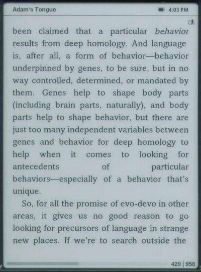
Look two-thirds of the way down the above page. See that line that says "antecedents of particular" with gigantic spaces between each word? That's a result of the nook failing to apply rule 2: the break should have been either before or after the em-dash in the following line (so that "behaviors—" stayed on the previous line). Instead, the nook treated all of "behaviors—especially" as a single word.

(If only "behavior," but not the em-dash, would have fit on the line above, then just "behavior" should have been retained on that line, and the em-dash should have wrapped around to start the next line.)

Note, too, by the way, that the last line of the page is short: it isn't quite fully justified, but instead stops about a half-character-width shy of the right margin. We'll see that error on every page we look at; it's yet another flaw in the nook's rendering of justified pages.

Let's look at another example (Figure 2):


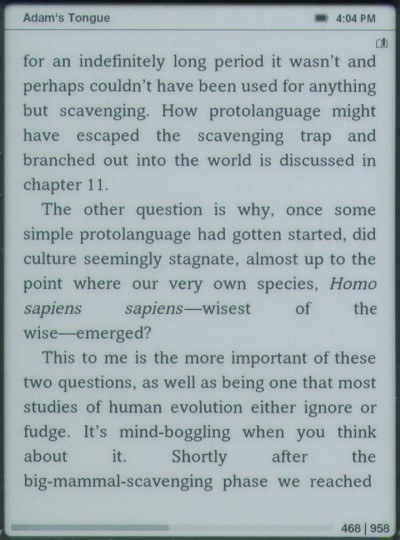
See the second last line, the one that says "about it. Shortly after the," with massive spaces between each word? That's the result of the nook failing to apply rule 3, breaking words at embedded hyphens.

Now, as it happens, in this example, the phrase "big-mammal-scavenging" is really three words strung together to form a compound adjective, but the nook makes the same mistake with single words that have an embedded hyphen (such as the way some people spell "micro-organism" or "co-operation"). The text should wrap after the last hyphen that will fit on the line: if all of "big-mammal-" would have fit, that should have stayed on the line above; if only "big-" would have fit, it should have stayed on the line above.

Oh, and above we see the em-dash wrapping problem again: just below the middle of page, the text should have wrapped after the em-dash in "wise—emerged," which would have eliminated the huge spaces in the preceding line.

As before, the final line on the screen (which is not the final line of a paragraph; yes, it's true that you don't right-justify the last line of a paragraph, but that's not what's going on here) comes up a short of the right margin.

And we discover yet another bit of nook-fail here: see the "the" at the end of the line "sapiens sapiens—wisest of the"? Note that the "e" is slightly clipped; its right-hand edge is trimmed off. We'll see that error repeatedly, too: the cause is that the nook's justification algorithms don't take into account the slanting of italic text, and the italics earlier in the line ("sapiens sapiens") have pushed the final "e" off the active part of the screen.

The "e" is only slightly clipped above, but we'll see that same flaw more egregiously in the next example (Figure 3):


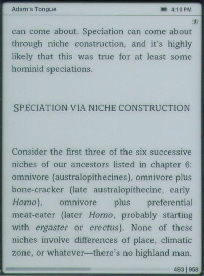
Look at the fifth line up from the bottom of the screen (starting with "Homo"). That line, and the next two, all contain italics, and all three show the clipping of the final character in the line because of it: the "l" in the first line; the "g" in the second, the "e" -- which is missing half of it width -- in the third.

We also on this page see the failure to wrap at an embedded hyphen, resulting in huge gaps between words: the line "Homo), omnivore plus preferential" should have also included "meat-" from the following line.

Now, just fixing the errors pointed out here (the failure to wrap properly before or after em-dashes; the failure to wrap properly at embedded hyphens; the failure to properly justify the final line on the screen) still wouldn't be enough to give the nook decent full justification, because to do that properly, avoiding huge swathes of white space between words, requires the intelligent insertion of hyphens into words.

Look at any printed, typeset book from a commercial publishing house. It will almost certainly have hyphens inserted at syllable breaks in some words at the ends of lines on each page, so that the words can be broken and wrapped over two lines. That is, words of more than one syllable that fall at the end of a line should frequently break after one of the syllables, with a hyphen added just before the break. This is done so that the spacing between words ends up being approximately the same even with full justification.

Hyphenation is a tricky thing to do right. Mobipocket's original attempt to stake out territory in the ebook marketplace was in part based on their claim to successfully hyphenate words -- but they simply used an algorithm that often got the breaks wrong (putting them within syllables, or between pairs of letters in consonant blends); a quick glance at the first Mobipocket book I opened just now showed these incorrect hyphenations within the first few pages: "sta-gnant," "remai-ned," "silen-ce," and "wal-ked" and "deadli-nes."

The only really good way to do it is by having the algorithm hand-coded with the correct syllabification points of many common words, and having it consult a dictionary interactively for uncommon ones. As it happens the Chicago Manual of Style, which is the most commonly used reference for the niceties of preparing text for the printed page, recommends Merriam-Webster's Collegiate for this purpose, which is the dictionary already built into the nook.

Finally, please note that one of the big sales points for ebook devices is that they can be used by those who need large print. But the larger the print gets, the worse full justification looks. By forcing it on at all times you take one of the great strengths of ebooks (user-selectable type sizes) and turn it into one of the great weaknesses (aesthetically ugly pages).

Fixes I'd suggest:

Dear Barnes & Noble, first and foremost, make full justification a user-selectable option; let us turn it off if we don't like it. This already is an option in many versions of the eReader software that underlies the nook, including the Palm version, the Windows versions (both eReader for Windows and BN Reader), the iPhone version, and more. Don't force those of us who dislike full-justification to have to look at it.

Second, if you are going to do justification, do it properly.

What we have here is a classic example of what's wrong with many ebook platforms: a failure to actually look at how it's done in printed books. If you're doing it a different way than it's done in print, ask yourself why. There are millions of guides -- millions of printed books -- you can consult as samples of how it should be done. Please do consult them; please do get it right.
Robert J. Sawyer online:
WebsiteFacebookTwitterNewsgroupEmail

Labels: ,


Monday, February 22, 2010

YouTube video of my ebook reader collection


My first-ever YouTube video, recorded Saturday, February 20, 2010: a survey of nine different devices I've used over the years to read ebooks.
"You're looking at in aggregate at about $3,000 worth of ebook-reading hardware here, and my own personal use almost nine years now of using devices to read ebooks. I'm an absolute convert to the concept of electronic-book readers. I just hope that we actually get the ideal hardware device, a decent price point, and the ability to share the content [between devices]." -- Robert J. Sawyer
Devices shown and discussed (with the dates I acquired them and the price I paid):
  • October 19, 2001: Handspring Visor Neo (Cdn$299)

  • October 20, 2001: Franklin eBookman 911 (US$229)

  • December 20, 2001: RCA REB 1100 (US$249?)

  • January 22, 2003: Sony Clié PEG-SJ20 (Cdn$269 -- not shown in the video))

  • September 7, 2004: Sony Clié PEG-TH55 (US$259)

  • September 26, 2006: eBookwise 1150 (US$115 with 64MB SmartMedia card)

  • May 3, 2008: iRex iLiad (a gift, list US$699)

  • December 18, 2009: ECTACO jetBook - Lite (U$149)

  • December 19, 2009: Foxit eSlick (US$259)

  • February 13, 2010: Barnes & Noble nook (US$259)
You can watch the video here.
Robert J. Sawyer online:
WebsiteFacebookTwitterNewsgroupEmail

Labels: , , ,


Thursday, February 18, 2010

The scandalous state of ebooks

An email I received this morning from my colleague Jamie Todd Rubin:
I ran into the same problem with the Kindle that you reported with the Nook regarding hyphenation. They implement full justification without adherence to any hyphenation rules and that makes some lines look awkward (4 words, widely spaced).

The other thing I've noticed, and I don't know if this is Amazon or the publisher, but in numerous books that I've read on the Kindle, there are substantial typos that appear to be the result of some kind of OCR import. The word "t-u-r-n" appears as "t-u-m" from time-to-time, but it's not consistent. There are other minor errors that I don't find in the printed text and I wonder if copyeditors look at the eBook text before it goes live.
Those are the three great scandals of the ebook industry:

1) The people designing the way pages are presented on screen seem to know nothing at all about typography. This ranges from the outrageous (the eSlick until last week's firmware update thinking that it was okay to break lines at the embedded apostrophe in words, or before the closing quotation mark) to the merely incompetent: the insistence on right justification ("because that makes it look like a book, see!") without understanding or doing any of the work required to make right justification aesthetically appealing.

2) The complete lack of proofreading or even spot-checking of ebooks before they are put up for sale. For example, I recently bought the eReader-format ebook edition of The Mind and the Brain by Jeffrey M. Schwartz and Sharon Begley, a book published by a major publisher (HarperCollins), and every line on every page throughout the book was centered -- no one had so much as glanced at the book after converting it.

3) The use of OCR as a way to get books into ebook format. For instance, Tor Books offers my Golden Fleece for the Kindle and the nook. For the print edition they typeset from my computer files, but for the ebook edition, they used a scan of the printed pages, and ran it through optical-character recognition. Page one proudly lists other books by "Rohert J. Sawyer."

Print publishers keep arguing that they have to charge high prices for ebooks in part because of the care and expense that goes into proofreading and laying out a printed book's text, but if that's just thrown out the window -- if not one dime of the money spent for that is actually reflected in the ebook edition -- then it's a specious argument to say that those costs need to be reflected in the ebook's price.
Robert J. Sawyer online:
WebsiteFacebookTwitterNewsgroupEmail

Labels: ,


nook suggestion: swap page buttons


I sent this suggestion to Barnes and Noble tech support today, and posted it on the nook discussion forum:
To my way of thinking, the page-forward and page-backward buttons are in the reverse of where they should be, given the weight and design of the nook.

If you hold the nook with your thumbs over the page-forward buttons (on either side), it's top heavy, and has a tendency to fall backward, and I'm always afraid it will drop backward out of my hands.

But if you hold the nook with your thumbs over the page-backward buttons (which are higher up, near the device's center of gravity), the nook is balanced nicely in your hands, but you have to reposition a hand every time you want to change a page.

Obviously, going to the next page in a book is a very common operation, whereas going to the previous page is something rarely done.

Because of this, I'd be grateful for an option to swap the function of the page-forward and page-backward buttons, so that the one labeled ">" went to the previous page, and the one labeled "<" went to the next page.

(By the way, a decade ago, the old Rocket eBook and its successor, the RCA REB-1100, offered this very option; they called it "reverse paging".)

Thanks for considering my suggestion.

Robert J. Sawyer online:
WebsiteFacebookTwitterNewsgroupEmail

Labels: ,


Tuesday, February 16, 2010

A nook of the north!


Last weekend, in Chicago, I bought a Barnes & Noble nook ebook reader. Since they're not for sale in Canada, I probably have one of the very few units in all of Canada now -- a nook of the north! (Yes, it was worth the US$259, just to get to make that pun.)

My initial thoughts:

The nook seems to have no trouble loading my content in eReader format from Fictionwise, and sampling and buying content wirelessly from Barnes & Noble seems to work fine.

The display is beautiful, but right-justification is forced to on, and the justification algorithms are terrible: even words with embedded hyphens (such as "middle-class") don't break at the hyphen (instead, the whole thing wraps to the next line), and em-dashes are treated as parts of words--frustratingly meaning that even if, in this sentence, "words," or "words--," would fit on one line, all of "words--frustratingly" wraps to the next line. That leaves huge gaps between words in the previous line. It is distracting and mars the aesthetics of an otherwise nice display.

(And the nook doesn't do hyphenation of its own -- which really is required if one is doing justification; look at any print book or magazine that has fully justified text, and see what a difference the hyphenation makes to the word spacing in the lines.)

Also missing is the ability to do a folder hierarchy (separate "Fiction, "Nonfiction," "Biography," or whatever you wish folders) in either main memory or on an expansion card, and the expansion card is very awkward to put in and remove; you won't be using it as a standard way to add new content.

The page-forward and page-backward buttons are in the reverse of where they should be, given the weight of the device. If you hold it with your thumbs over the page-forward buttons (on either side), it's top heavy, and has a tendency to fall backward; if you hold it with your thumbs over the page-backward buttons (which are higher up), it's balanced nicely in the hands, but you have to reposition a hand every time you want to change a page.

But except for those things, it works quite nicely.

It does not have a backlight for the main screen. Having the color LCD screen below the main screen (which is used for navigation and menus) light up in the dark (which it did once spontaneously on me last night) does starkly remind one of this lack.

Page turns (with the new 1.2 firmware, which came preinstalled on my unit) are fast; and the nook wakes up from hibernation very quickly, leaving you right at the page you were last reading.

It's substantially heavier than the Foxit eSlick -- the other e-ink device on the market that supports Fictionwise's eReader format -- and the eSlick does support folders. Also, the eSlick supports landscape mode, and the nook does not.

But the nook wins hands-down because you're back to reading your book in 2 seconds after picking up the device if it's hibernating (and only have to hit the power button to get there), versus 23 or so with the eSlick (and on the eSlick you have to re-select your book from a menu after powering up).

The nook does have a built-in dictionary (Merriam-Webster's Collegiate -- a very good one), but the interface for selecting a word on the e-ink screen is very awkward and time-consuming; the eSlick has no dictionary support.

The nook is a nice device, and I'm glad I bought it, but it needs at least one more firmware upgrade. The justification issue has to be fixed (first, it should be user-selectable whether it's on or off; second, it should obey the rules of typography when on). A better interface for selecting words for dictionary lookup (and highlighting) needs to be devised. And I'd like to see the ability to swap the functions of the page-forward and page-backward buttons.

But it is a great example of what an e-ink device can be.

Robert J. Sawyer online:
WebsiteFacebookTwitterNewsgroupEmail

Labels: ,