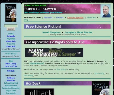
The design of Rob's website at SFWRITER.COM
An email I received today said in part:
I've read several pages at your Web site. As a well-wisher and a Web programmer, I urge you to consider improving the colour and general design of the site. My kind are cheaper than a dime a dozen but if I can be of assistance, do let me know.I get comments like that periodically (although I get far, far more praise for the site than I do complaints). My response:
Many thanks for the kind words. They're very much appreciated!And I certainly do welcome suggestions. I'll probably give the site a facelift or a spruce-up over the next few months as we gear up for the release of Watch, my next novel. Thoughts?
I've looked at other authors' websites, and rarely see one that I like, especially from an accessibility point of view.
I insist on having a site that resizes well to any size screen (including those on mobile devices); that uses actual text, not graphics, for all words (so they can be resized and so that screen-reading software used by the blind will have no trouble with them); that doesn't constrain text sizes or hard-code specific point sizes (so that the user can resize up as much as he or she wishes); and that does not use frames, which I find awkward and clumsy.
The choice of colours is personal, I grant you, but I'm genuinely curious about what general sort of changes you'd suggest given the above constraints.
Now, yes, some have said there are too many words on my web pages, but given that my site's purpose is to drive sales of books that are each around 100,000 words long, it seems that catering to those who don't wish to read very much text would be counterproductive. :)
By the standards of SF author websites, mine excels in terms of depth of content (with over one million words and over 500 pages) and certainly is in the top half in terms of layout and design.
Also, I actually enjoy coding my own site; it's all hand-coded in HTML. I've been doing it since 1995, and I make several changes each week to the site (often small things, but I need to be able to maintain it myself to do that). So, I'm not looking to hire someone to do it for me. But I'm always open for suggestions as to how to make it better.
The Robert J. Sawyer Web Site
Posted by Rob on Monday, December 08, 2008
[Permanent link to this post]
6 comments
![]()
![]()


6 Comments:
I too hate tons of useless graphics, frames, Flash, flippy-floppy dancing things, and all that fancy crap that web designers think look cool and/or make a web site functional.
Give me straight basic text and I'm happy. Like you said, something that's easily altered for a person's taste. My parents like big fonts (they're both mid-60s) and get frustrated with sites where they can't change it in their browser.
DON'T CHANGE A THING.
Your site is excellent the way it is. It's clean, easy to navigate and easy to get lost in - that's a good thing, it keeps you poking around. Too many times you go to a site and get confused, lost or it's too glitzy so you leave, after a whole 45 seconds. Your site keeps you interested.
As for colour scheme, it's fine. A white background is too hard on the eyes. And there are just way too many colour combinations that just don't work. Yours is easy on eyes. The colours disappear letting you devour the contents.
All in all. An excellent site. Don't change a thing.
Thanks, Don! I use that pale green as the background for applications in Windows, too; makes things like Word much more pleasant to work in.
Right-click on the desktop, select "Properties," "Appearance," "Advanced," "Window" (from the "Item" drop-down list), "Color 1," "Other," and plug in these values:
Hue 80
Sat 69
Lum 194
Red 192
Green 220
Blue 192
H Don is right on! What is the purpose of a Website if it's not user-friendly? Our eyes take a beating just trying to make a living...
I've always thought your website was all about content - and such wonderful content!
Nothing drives me crazier than overly-complicated websites (there is a special place in hell for the person that thought that flash-based websites for promoting movies). You're absolutely right - your fans are readers. We want your words!
Judy
I have to say that I agree with the original email. The color choices feel a little dated and I find the design to be a little "cluttered." (For example, the thick purple title bars with a nebula image covered up slightly with cover shots of your book feels too heavy to me.)
But I think the biggest design problem is that, for me, the colors clash -- purple, pale green and blue -- most colors by themselves are pretty innocuous but in the wrong combination can feel very "off."
This is a really fun design applet that lets you test color combinations: http://kuler.adobe.com/
Of course, it's all very subjective and not very important relative to the content of the site, but I would characterize the color scheme and design of the site as "retro" -- it has the feel of a well-designed site in the late 90s to me.
Check out johnaugust.com and janeespenson.com to see some alternative design directions.
Of course, none of this is about fancy stuff. It's not about adding java or frames or animation. It's the simple design choices -- the choices that won't change the functionality of the site: color, line width, etc.
I think that by improving the color scheme, eliminating the heavy title bars, and generally simplifying the design you would be doing the great content an even greater service.
I should be clear that I love the content of the site, your work and your presentations. I genuinely think you and your work are some of the most exciting and interesting of the new century, but I would be lying if I said that I didn't agree that the site could use some design upgrades.
Many, many thanks for the very thoughtful commentary, Scott! Much appreciated!
Post a Comment
<< Home